Friday, 10 October 2014

Relevant Photographer to Clay' Barber - Analysis

This photo was taken by Dawoud Bay in 1976 (printed in 2005). The first thing I noticed about this picture was that the Bay had chosen to shoot in black and white. Colour photography had been around for quite a while but Bay still made the concious decision to shoot in black and white. While looking specifically into Clay's Barbers, I noticed that the colours in the building were very bland and flat. This would not have made for an interesting colour photograph and I am wondering if this is the reason for Bay choosing to shoot in black and white. The image shows the environment the barber works in since it is not a tightly shot as my images. Although this photograph was taken 38 years before mine, there are a large number of similarities in what Bay and I have chosen to include in our pictures for example showing a large number of specialist barber equipment.


Jimmy Jeong is a photojounalist from Vancouver, Canada. He aims to tell honest stories through his photographs in his editorial, commercial and portrait work.

This image was take on 14th July 2008 at the Kings Barbers Salon in Vancouver. Much like my photographs of Clay's, Jeong has shot the barber whilst he is working on the client instead of staging a portrait; this is to sow the 'person at work'. There are several similarities in mine and Jeong's photos including them both being in black and white. The contrast in this image is very aesthetic which is likely to be why Jeong chose black and white over colour. I love the composition in the photo. The barber is right in the middle of the shot with his client to the left and then a unique angle of another barber at work in the background which is visible in the mirror on he right of the image. Since Jeong as used a low apature, the viewer can see detail in the entire image meaning both barbers can clearly be seen and the environment they are working in can also be gauged.


Rita Firmino de Sa is a freelance photographer, artist and writer based in London.

This image is the most like mine out of these three. It is shot far tighter to the subjects and really concentrates the viewers focus on the detailed work being done using a shallow depth of field. Also, Rita has used te barbers hands/arms to put a frame within a frame which adds another interesting element to the photo. Below is my photograph that is similar to this one. We also both shot in black and white again. As I found, most photographers feel that shooting in black and white in barber shops produces a far more desirable final image since the detail in the hair and contrast are improved. Also, the colours are often dull in these shops potentially making for a flat and uninteresting colour image.


This image was shot by Roberta Cucchiaro in Xinjiang, China of a street barber in summer 2006.

One of the reasons I liked this image was that it feels that the man and woman in the shot do not know the image is being taken or that the photographer is even there. The fact that the shot has also clearly been taken very close to the man and woman makes this aspect even better. I feel that the sense of invisibility in any photograph gives it a far more natural and therefore informative and accurate photograph.

This image is fairly similar to mine that I have shown above in that the subject is not looking at the camera. Since Cucchiaro's image is shot on the streets of China and mine was in a barbers shop I feel that Cucchiaro's feels far more natural and makes for a better image in this respect.

Person At Work - Clay's - Final Image

I chose this as my final image because I love the way Garnett and the work being done is framed within the barbrs arms and body. I have fully dropped the barber out of focus in order to draw the attention to the main focus point being the work being done in the centre of the frame.

It has been converted to black and white because I felt that contrast looked far better and since the lighting in the barbers was very poor, the colours were flat throughout the image.

The one part of this image I do not like is the arm of the barber being slightly over exposed. I feel that this slightly draws my attention away from the subject becaus it stands out so much being bright.

Thursday, 9 October 2014

Final 3 - Clay's - Person At Work

These are the final 3 images for my Clay's shoot. They are all close ups because I felt that this shows the skill and precision of the barber that I shot working. It also helps to show detail.


One of my favorite aspects of this first photograph is the hair on the barbers hand. It has great contrast against the white of his skin and shows how hands on his job is.

One of the things in this image I didn't like is the left hand of the barber. It is over exposed and in my opinion takes up too much of the frame. Another part of the picture I didn't like was the fact that I find the background quite distracting. The gown that the subject is wearing has quite a complicated texture which could direct the viewers eyes away from the subject.  Other than this I feel that this photograph shows a 'person at work' well and is interesting to look at.


The main part of this photo that I like is the composition. The subject of the photo is being framed by the arms and head of the barber. These parts of the image are dropped out of the point of focus which leads the viewers eye directly to the subject directly in the centre of the frame. This really shows the viewer a person at work and gives a unique angle of it.

The only part of this image I don't like is very similar to the last. The left arm of the barber is again over exposed

This is the final of the 3 images. I chose this one for several reasons. One of the reasons is very subtle which is the aesthetic lighting on the small section of comb and from the out of focus lights in the background. Although this may not make the photo technically better, I feel it improves the aesthetics which makes it more interesting to look at.
Also, this is probably the clearest image in terms of showing what the worker is doing. The detail is very precise and you can see each individual hair coming through the comb that the barber is about to cut off. This shows precision and detail in the barbes work.


Wednesday, 8 October 2014

Final 8 Photos of Clay's Barbers - Person At Work


 These images are the ones I chose to use for my final 8. Out of all the shots I took at Clay's barbers, I found these to be the most interseting, unique and informative.

I tried them all in black and white and colour but decided that due to the poor lighting in the shop they looked far better in black and white.


Sunday, 5 October 2014

Clay's Barbers - Person At Work

Clay's is a barbers shop in Falmouth town centre and when researching for ideas and inpiration for places/people to photograph, I found this very local business which had a number of inspiring photos on its website. This gave me lots of ideas for shots and different ways of representing 'people at work' in Clay's so I got in contact and they were more than happy for me to take photos of them whilst they worked on clients.

Before this shoot I had already done 3 - An artist, flourist and a clothes shop. The reason I chose to do another is that I did not like any of the shots that I got from the clothes shop or flourist so I wanted to reshoot something completely different.

This shoot was definately my favorite and I got several images from it that I am going to analysis and edit down further to get my final 8x10 print.

Wednesday, 24 September 2014

Photography relevant to first shoot - Arnold Newman


Sculptor Alexander Calder in his studio, 1957

Newman's portrait of Alexander Calder differs from my photographs in that Calder is the main focus of the image. I have set out to make the art the focus of my photographs, showing how the artist's concentration leads towards the final product. However, this photograph and mine both give a feel for the atmosphere in the studio. Newman's image shows the studio as a complex place while mine shows part of the studio and limits its complexity to the work the artist is producing. I have chosen to use a shallower depth of field in my photographs which concentrates the viewer on the small section of image that is in focus as being the most important part. Newman has done the opposite and although he has made the artist as the main subject, no part of the image from infront or behind the point of focus. This makes the image take longer to take in but also shows the disorganisation and vast amount of work that Calder has produced.


Roy Lichtenstein, American pop artist, South Hampton, N.Y., 1976

Newman's portrait of Roy Lichtenstein is similar to Calder with the focus being on the artist. This time, he has used a much cleaner, simpler background which is more similar to the background of my photographs. I find this means the viewers eyes are drawn to the subject and are not distracted by the less important and informative background. The complexity of this image is more linked to the pose of the artist and his expression which, it could be argued, is a thoughtful one, as if he is creating ideas in his head in a similar way to my photographs showing the artist creating the first stage of a painting. The artist in my photographs shows a more complex side to a relatively simple looking painting with the complex drawings he must create first.


Pablo Picasso, Cannes, France, 1956

In this photograph of Picasso, Newman has also focused on the artist and used the studio as a background to tell the viewer more about him. My photographs show a fairly nonedescript background which gives the feeling that the art is the most important aspect. In his image, the background is important because it shows other examples of Picasso's work and this shows the importance of his cubism paintings to him. Again, Newman has not dropped anything out of focus proving to the viewer that everything has important. The main subject of this image is clearly Picasso but Newman is showing that the other aspects of the image such as the environment he is working in a his iconic work has equal importance.


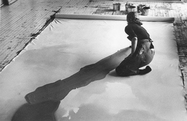
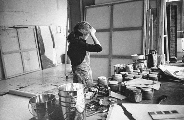
 These images are of abstract and expressionist painter and artist Helen Frankenthaler being photographed in her NYC studio by Austrian photographer and artist Ernst Haas, 1969. Haas took great interest in Frankenthaler's work and took and published several images of her. The two images I have selected stood out to me because I feel that they show the passion the artist has for her work. She is seen very involved mentally and physically in her work.

Both my images and Haas' images show the initial stages of a piece of art. The detail is far more precise in the artists work in my images but in both you can see the complexity of the art. For example, in Frankenthaler's work, the you can't tell what the painting is going to be, suggesting there is going to be far more put into the work.

Also, both Haas' and my work shows a little taste of the studios/environment the artists are working in but not drawing too much attention away from the main subject of the 'person at work'. This is to give the viewer a more informative image but at the same time ensuring there is a clear focus in the picture.


Tuesday, 23 September 2014

Final Image - Artist - Person At Work

One of the reasons I have chosen this image for my final 8x10 print is because I feel that the other two leave me wantin to see more of the surroundings and feel that the frame crops out important aspects of the environment which would give the viewer more infomation about the profession. This image shows more of the surroundings of the gallery and the artists work space.

Also, the light coming from the lamp gives off a beautiful lighting effect across the artists work. This is the only reason why I kept the image in colour as opposed to black and white. Also, as I mentioned before, the angle of the shot (over the shoulder) shows the work from the painters point of viewer making it unique and in my opinion, more informative.

Finally, I find the complexing of the work very engaging and I think this photograph compliments the difficulty and precision of the work. It also shows a very different side to the paintings because when they are finished you cannot see any of the fine lines or detail that you can see in this image.