Saturday, 13 December 2014

Final Image - Isolation - Hospital

This is the image that I have chosen for my final 8x10 print. This is because I feel it shows isolation the best and has the most impact. It is very clear that the patient is in a hospital from the tag visible on her arm and the wires in the background. She looks unwell, weak and vulnerable which help add to the negative portrayal of isolation.

The shot is in black and white because it improves the image aesthetically and helps enhance the paleness of the patients face. Also, the expression she is pulling suggests that she is not sleeping normally and that she has had general anesthetic. This makes for an interesting establishing image for a story about isolation.

Friday, 12 December 2014

Hospital - Isolation - Establishing Image

For the isolation image of Establishing Image I used a patient in a hospital that was bed bound with no visitors for a number of days. I thought this was a good representation of isolation because the woman was completely isolated from the outside (normal). This is a very negative representation of isolation.

This first image shows the woman (Nel) still heavily sedated after being in theatre. I feel that this is a very 'real' impact shot that lines up for an interesting story. Small aspects of the image such as her head being tilted with her mouth slightly open adds to the rawness of the image showing a woman in a very vulnerable situation that isn't often photographed due to the sensitivity. Also, her arms being limp to the sides of her enhance the same effect.

The lighting in the ward was poor and I didn't feel comfortable with turning more lights on due to the environment I was in. Therefore, I compensated by using a very high aperture and ISO. The downside of this is that I had to sacrifice some quality. Also, the colours in the image were very dull which is why I chose to convert it to black and white.


I carefully shot the image from this angle to reinforce the idea that Nel was alone and that she did not have anyone (me) there with her. I chose to do my first shoot with her still sedated because I felt that she would act slightly differently if she was conscious which would make the image less powerful.


I chose this image for my final 3 because I feel it shows that people in hospital in some ways lose an element of their humanity due to the need for them to be wearing a tag to identify them.

I converted this image to black and white for exactly the same reason as the image above, due to the bland colours. I felt that it had a better impact without the few colours and helped portray the cold isolation of the patient.

I dropped Nel's face out of focus because I did not feel that it was the main focus of this image. I did not remove this aspect from the image completely because I think it makes it more personal and gives more information but the tag on her wrist is the main subject of this photo which is why it is the only part of the frame that is within the focus point. I achieved this by using a high aperture of f/2.8.


The final of the 3 images shows Nel on another visit where the sedation has fully worn off and she is seen peacefully sleeping. The elements of her being isolated and wearing the tags still remain but a different atmosphere is portrayed due to her looking far less ill. Her head is straighter on the pillow, her mouth is closed and her hands are gently folded across her chest. This shows that she is more comfortable than in the other images and that she has more control which shows less vulnerability although a similar amount of isolation.

Again, I converted this image to black and white because I feel that is adds to the feel of isolation and makes the image technically better due to removing the dull and flat colours.

Thursday, 11 December 2014

Contact sheet - Hospital - Isolation - Establishing Image


I did this shoot over the Christmas period when I was back home in Dorset of a patient in Poole hospital. I visited the pateint several times to get different stages of her recovery after a large operation.

The shoot went well despite struggling with little room and very poor light.

Friday, 5 December 2014

Docks - Industrial Coast - Final Image

I have chosen this as my final image because I feel that it draws the audience in the most. It took me quite a while to find a shot that was close enough to being perfectly symmetrical. None of the shots I took were perfect in this respect but close enough that I could use the cropping tool in Lightroom to straighten this shot out.

I got the exact effect I wanted to in this shot with the lighting. The boat is aesthetically lit and using a high ISO and slow shutter speed I managed to capture all of the light that was present. This has helped me make the ship 'pop out' from the background/dark areas.

The task was to show industrial coast in relation to an establishing image. The story behind this image is the vast number of large ships that are constantly coming in and out of the falmouth docks making it a very active industrial area.


Docks - Industrial Coast - Establishing Image

I feel that this image shows 'industrial coast' very well. I chose the docks because it was the first place that came to mind locally as being industrial coast and is one of the most well known parts of falmouth. Also, the docks are very complex and always have large ships docked or being worked on there making potential for an interesting image.

I chose this image to be in my final 3 because of the composition. I carefully framed the photograph so that the centre of the boat was directly in the centre of my frame. I think that putting symmetry into photos is hard to make it look 'right'. If it is not perfectly symmetrical it is very off putting. It took me several attempts to get a shot where I was happy with the symmetry and this shot is shown here.

I chose to shoot in the dark because I knew there were a lot of lights around the docks and since I was shooting from above, I felt that I could add an aesthetic and unique view of the environment that most people wouldn't see as they would be there during daylight. This did lead to difficulties with exposure because when I got to the area, I found that the railings where too high for me to use a tripod without the metal getting in the shot. Therefore, I had to hold the camera by hand a push the ISO very high, up to around 2000 in order to get a decent exposure. This meant I had to sacrifice some detail in order to shoot at this time of the day at this location.


This shot is very similar to the first of the same ship but at a different angle. I chose to shoot from this angle to show more of the ship and therefore give more information about the industrial coast subject. This is important due to the title of the brief being 'Establishing Image'. This means it needs to show as much information it can to the story behind it. The story being about the falmouth docks being such an active area.

Again, I lost some quality in this image due to a boosted ISO in order to  deal with the low light. The way I prepared for the low light problem was to use a Canon 6D which is a full frame camera with 20 megapixel sensor. This was to allow me the most chance of maintaining quality in an already grainy image which I may have to crop.


This last shot I tried to make the image fairly dull apart from the subject in the centre which is the brightly lit ship emerging over the large building in the foreground. This is my least favourite shot out of the three because the composition hasn't worked as well as I'd have liked. This could have been improved by making the frame tighter to the subject but due to the grain in the image, I cannot do this without loosing a lot of detail and quality. I have considered re shooting this shot but after looking into this I have decided that I prefer the previous 2 anyway even if this was shot again.

Tuesday, 2 December 2014

Relevant photos - Truro City of Lights - Establishing Image

This photo was taken by Dan Kitwood at the 2014 Notting Hill carnival. I chose to analyse this image because I feel that it shows the true atmosphere of a close community very well. Kitwood has got himself right in amongst the excitement and has really portrayed this through his image. Also, the image is in no way staged and no one seems to be aware that the photographer is taking a photo. This makes it more natural and gives us a more accurate sense of what the atmosphere is really like.

He has used a wide angle lens to allow him to get very close to his subject which enhances the effect of us being there in the happy atmosphere.

Kitwood has used a low aperture to ensure more or less everything is in focus. This is because all elements seen in the frame are important to the photograph.


This photograph (shot by Alan Diaz) stood out to me because of the energy portrayed by the subject. Although the image is very posed it still gives a feel of natural joy and atmosphere of the A Miami-Dade carnival dancer performing at the annual Martin Luther King Day parade in Miami.

The frame is filled by a close up of the male and he large exciting constume which make it interesting. The colours really bring the image to life and give an idea of the sort of event/ atmosphere the performer and photographer are at. Diaz may have chosen to give less infomation by not showing he environment as much because he feels that this tightly framed image gives enough infomation.


This image was shot by Thomas Hawk at the festival of colour in Utah, USA in 2012. He captured a series of incredible photographs of a very unique event. I loved this image because it shows the atmosphere of the event so well and the magnitude of it. The vast number of people covered in colourful pain makes the image very unique and interesting. The slight misty effect in the backgroud slightly distorts/blurs the invididual people making the image very artist. The backgroud shows more of just vibrant colour than individual people which is a pleasing contrast the the clear seperation of people in the foreground.

Monday, 1 December 2014

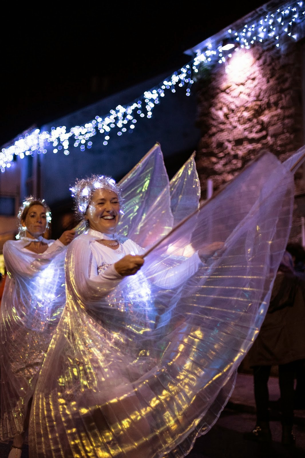
Final Image - Truro City of Lights - Establishing Image

I chose this shot for my final image for the 8x10 print. I managed to get close to the subject to fill the frame so I didn't have to crop. I had to crop quite a bit in other photos and due to the low light and therefore high ISO this made these few photos lower quality and a little more grainy. The main part of the image I like is the animation of the woman. I feel that this perfectly portrays the atmosphere of the event and as a press photographer I feel that showing accurate detail and information in a picture is the most important aspect.

Also, the colours in the lights that the woman is wearing makes the image more aesthetic and helps light up and therefore emphasise he womans face which is the most important part of the image. The lights that are out of focus at the top of the frame give the same aestheic feeling as the lights on the woman. They represent the turning on of the lights in the city which is the main purpose of the event, making this a significant part of the image. Also, without them there would be a large blank, dark space at the top of the photograph which would make the image less strong as a whole. I feel that every part of an image should add to the finished product and there should be as little 'wasted' in the frame as possible.