Sculptor Alexander Calder in his studio, 1957
Newman's portrait of Alexander Calder differs from my photographs in that Calder is the main focus of the image. I have set out to make the art the focus of my photographs, showing how the artist's concentration leads towards the final product. However, this photograph and mine both give a feel for the atmosphere in the studio. Newman's image shows the studio as a complex place while mine shows part of the studio and limits its complexity to the work the artist is producing. I have chosen to use a shallower depth of field in my photographs which concentrates the viewer on the small section of image that is in focus as being the most important part. Newman has done the opposite and although he has made the artist as the main subject, no part of the image from infront or behind the point of focus. This makes the image take longer to take in but also shows the disorganisation and vast amount of work that Calder has produced.
Roy Lichtenstein, American pop artist, South Hampton,
N.Y., 1976
Newman's portrait of Roy Lichtenstein is similar to Calder with the focus being on the artist. This time, he has used a much cleaner, simpler background which is more similar to the background of my photographs. I find this means the viewers eyes are drawn to the subject and are not distracted by the less important and informative background. The complexity of this image is more linked to the pose of the artist and his expression which, it could be argued, is a thoughtful one, as if he is creating ideas in his head in a similar way to my photographs showing the artist creating the first stage of a painting. The artist in my photographs shows a more complex side to a relatively simple looking painting with the complex drawings he must create first.
Pablo Picasso, Cannes, France, 1956
In this photograph of Picasso, Newman has also focused on the artist and used the studio as a background to tell the viewer more about him. My photographs show a fairly nonedescript background which gives the feeling that the art is the most important aspect. In his image, the background is important because it shows other examples of Picasso's work and this shows the importance of his cubism paintings to him. Again, Newman has not dropped anything out of focus proving to the viewer that everything has important. The main subject of this image is clearly Picasso but Newman is showing that the other aspects of the image such as the environment he is working in a his iconic work has equal importance.
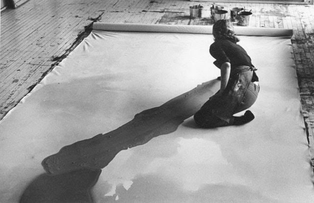
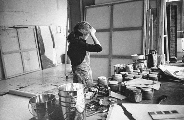
 These images are of abstract and expressionist painter and artist Helen Frankenthaler being photographed in her NYC studio by Austrian photographer and artist Ernst Haas, 1969. Haas took great interest in Frankenthaler's work and took and published several images of her. The two images I have selected stood out to me because I feel that they show the passion the artist has for her work. She is seen very involved mentally and physically in her work.
 Both my images and Haas' images show the initial stages of a piece of art. The detail is far more precise in the artists work in my images but in both you can see the complexity of the art. For example, in Frankenthaler's work, the you can't tell what the painting is going to be, suggesting there is going to be far more put into the work.
Also, both Haas' and my work shows a little taste of the studios/environment the artists are working in but not drawing too much attention away from the main subject of the 'person at work'. This is to give the viewer a more informative image but at the same time ensuring there is a clear focus in the picture.


