Thursday, 18 December 2014

Relevant Photographers to Docks - Establishing Image

This image, shot by Jean-Claude Coutausse, shows a container ship unloading in the Delwaide Dock on the Scheldt river, Belgium; July 2010. I chose this image because I feel that it really shows the huge size of the container ship. As an establishing image, I feel that it is important to give the viewer an idea of the size of the boat due to it being so abnormally large; it is likely to play an important part in the story. This image has been carefully framed to show the size by using half the frame to show the docks and half to show the boat. This enables easy comparison between objects that the viewer can easily recognise to the rough size of the boat.

The difference between this image and mine is that mine is shot at night and this during the day. I chose to shoot mine at night because I knew the lighting over the docks at night was very aesthetic and that I could shoot it from above. This may not have been an option for Coutausse meaning he chose to shoot during the daylight. Also, there are aspects of his photograph that would not show up at night due to low light and long exposure such as the men in the foreground which show scale.


This image is taken by John H. Avery and is of a ship in King George V dock. The ship is possibly the Euripides and the dry dock is about to be flooded to allow the ship to leave after repairs.

I love the angle this image was shot at. It shows the sheer size of the ship and the precise engineering gone into making it. The dry dock helps to show more of the boat which makes the image more interesting because most of the time a boat is mostly underwater.

This image is very similar to one of mine which I have shown below. It is shot directly in front of the boat showing perfect symmetry. This is not only aesthetic but also gives us a better understanding into what the boat looks like.

A difference between this photograph and mine is that it is shot in black and white. At this time, this was the only option. I chose not to do this because I shot during the night and felt that the lighting added to the look of the photo especially seeing as the boat was bright red. It also helped it to stand out from the less important background.


This photograph was taken on 02/03/1912 of the Titanic in a dry dock having propellors fitted and a final coat of paint applied. I could not find the photographer that took this image but decided to keep it in my research because it was a photo of such an iconic ship to symbolise industrial coast.

Although there is quite clearly a fair amount of marks and damage to the negative of this shot, I still think it offers a lot. It is not the most technically brilliant image but bearing in mind it was taken almost 100 years ago and still provides us with information about this iconic ship is what I think makes it for me.

The image is clear and sharp and since it is shot from above and in a dry dock we can see so much of the ship. This is important for press photography in this sense because it is important to give the viewer as much relevant information as you possibly can through an image and caption.


This is a photograph of HMS Illustrious alongside the new carrier at the dockyark in Rosyth taken by Tam McDonald.

I chose this image because the ship at first blends in with the surroundings. This is often seen as a technical fault in photos since the main subject is not particularly standing out from the rest of the image. In this case I think it really works because it shows the sheer scale of the docks that the boat is in. The size of the docks is clearly an important part of the image that McDonald wanted to show.

This image is very similar to one of mine that I used in my final three shown here. I used the artificial light since I shot at night to help make the ship stand out from the surrounding docks because like McDonald I did not frame the image around the subject tightly to show some of the surrounding area.


Sunday, 14 December 2014

Photographers relevant to Hospital - Isolation - Establishing Image

Leah and Kristin Jent are sisters that specialise in baby, child and family photography.

I chose this image because I feel that it is very powerful. The isolation is not only shown by the woman being by herself but also by the equipment that she has around her head. This makes it very clear that she is different from others and therefore isolated in this hospital room.

The Jent's decided to convert this image into black and white. I feel that the contrast is very strong and makes the image more interesting whether or not this is the reason for them doing it. Also, when I was shooting in the hospital, I found that the colours were very dull making it less powerful and more 'boring'.

The only aspect of the image I do not like so much is the left hand side of the frame. I feel like there is too much empty space that doesn't tell us any more infomation which is important for an establishing image. Having said this, the photographers may have done this to emphasise the isolation.


Kevin Lamb is a photographer who took a series of photos in a psychiatric hospital. This shows great isolation because the people within the hospital are carefully isolated from others and the normal world.

I feel that this image shows real isolation and in a negative way. The patient is in a room that looks very similar to a prison cell, with no personal items or any comforting items. The idea of a prison is to isolate people from the outside world. It feels as though these people are possibly unfairly isolated in the same way. The difference is that there is nothing they can or could have done about it due to their mental health.

Lamb has shot the image of the back of the woman. This makes it more mysterious and shows isolation further. This is because it feels as though the woman can't even face society.

Converting the photograph to black and white also makes it feel colder and emphasises the loneliness of the woman.


Fergus Falls State Hospital, or the third Asylum. This hospital was built in 1888 and abandoned in 2008. It was built to house all those whose psychological conditions excluded them from interacting with the general population. This is a perfect example of isolation. A lot of these people were said to be able to lead almost 'normal' lives if they hadn't been taken to the Hospital.
On July 29th, 1880 the first two men were sentenced to the asylum, joined the next day by eighty transfers from St. Peters. St. Peters was one of the current asylums in the area that was massively over populated.

The picture I have chosen shows a ward in the hospital. Although it is full of patients, I still feel that it shows a strong sign of isolated. The patients do not appear to be talking to one another or interacting with anyone at all. Much like the image before, there is a sense of inprisionment. The photographer has shot the image so that it portrays the too men standing up in a authoratitive way. This is an image of the exact same room from the same angle in 2008 after it had been abandoned. From this we can see that the environment was clearly designed to isolate people that were different and not to make them comfortable or help them live a normal life. I think it is important to show both of these images to show this because it is not just the pateints that show the isolation.

Saturday, 13 December 2014

Final Image - Isolation - Hospital

This is the image that I have chosen for my final 8x10 print. This is because I feel it shows isolation the best and has the most impact. It is very clear that the patient is in a hospital from the tag visible on her arm and the wires in the background. She looks unwell, weak and vulnerable which help add to the negative portrayal of isolation.

The shot is in black and white because it improves the image aesthetically and helps enhance the paleness of the patients face. Also, the expression she is pulling suggests that she is not sleeping normally and that she has had general anesthetic. This makes for an interesting establishing image for a story about isolation.

Friday, 12 December 2014

Hospital - Isolation - Establishing Image

For the isolation image of Establishing Image I used a patient in a hospital that was bed bound with no visitors for a number of days. I thought this was a good representation of isolation because the woman was completely isolated from the outside (normal). This is a very negative representation of isolation.

This first image shows the woman (Nel) still heavily sedated after being in theatre. I feel that this is a very 'real' impact shot that lines up for an interesting story. Small aspects of the image such as her head being tilted with her mouth slightly open adds to the rawness of the image showing a woman in a very vulnerable situation that isn't often photographed due to the sensitivity. Also, her arms being limp to the sides of her enhance the same effect.

The lighting in the ward was poor and I didn't feel comfortable with turning more lights on due to the environment I was in. Therefore, I compensated by using a very high aperture and ISO. The downside of this is that I had to sacrifice some quality. Also, the colours in the image were very dull which is why I chose to convert it to black and white.


I carefully shot the image from this angle to reinforce the idea that Nel was alone and that she did not have anyone (me) there with her. I chose to do my first shoot with her still sedated because I felt that she would act slightly differently if she was conscious which would make the image less powerful.


I chose this image for my final 3 because I feel it shows that people in hospital in some ways lose an element of their humanity due to the need for them to be wearing a tag to identify them.

I converted this image to black and white for exactly the same reason as the image above, due to the bland colours. I felt that it had a better impact without the few colours and helped portray the cold isolation of the patient.

I dropped Nel's face out of focus because I did not feel that it was the main focus of this image. I did not remove this aspect from the image completely because I think it makes it more personal and gives more information but the tag on her wrist is the main subject of this photo which is why it is the only part of the frame that is within the focus point. I achieved this by using a high aperture of f/2.8.


The final of the 3 images shows Nel on another visit where the sedation has fully worn off and she is seen peacefully sleeping. The elements of her being isolated and wearing the tags still remain but a different atmosphere is portrayed due to her looking far less ill. Her head is straighter on the pillow, her mouth is closed and her hands are gently folded across her chest. This shows that she is more comfortable than in the other images and that she has more control which shows less vulnerability although a similar amount of isolation.

Again, I converted this image to black and white because I feel that is adds to the feel of isolation and makes the image technically better due to removing the dull and flat colours.

Thursday, 11 December 2014

Contact sheet - Hospital - Isolation - Establishing Image


I did this shoot over the Christmas period when I was back home in Dorset of a patient in Poole hospital. I visited the pateint several times to get different stages of her recovery after a large operation.

The shoot went well despite struggling with little room and very poor light.

Friday, 5 December 2014

Docks - Industrial Coast - Final Image

I have chosen this as my final image because I feel that it draws the audience in the most. It took me quite a while to find a shot that was close enough to being perfectly symmetrical. None of the shots I took were perfect in this respect but close enough that I could use the cropping tool in Lightroom to straighten this shot out.

I got the exact effect I wanted to in this shot with the lighting. The boat is aesthetically lit and using a high ISO and slow shutter speed I managed to capture all of the light that was present. This has helped me make the ship 'pop out' from the background/dark areas.

The task was to show industrial coast in relation to an establishing image. The story behind this image is the vast number of large ships that are constantly coming in and out of the falmouth docks making it a very active industrial area.


Docks - Industrial Coast - Establishing Image

I feel that this image shows 'industrial coast' very well. I chose the docks because it was the first place that came to mind locally as being industrial coast and is one of the most well known parts of falmouth. Also, the docks are very complex and always have large ships docked or being worked on there making potential for an interesting image.

I chose this image to be in my final 3 because of the composition. I carefully framed the photograph so that the centre of the boat was directly in the centre of my frame. I think that putting symmetry into photos is hard to make it look 'right'. If it is not perfectly symmetrical it is very off putting. It took me several attempts to get a shot where I was happy with the symmetry and this shot is shown here.

I chose to shoot in the dark because I knew there were a lot of lights around the docks and since I was shooting from above, I felt that I could add an aesthetic and unique view of the environment that most people wouldn't see as they would be there during daylight. This did lead to difficulties with exposure because when I got to the area, I found that the railings where too high for me to use a tripod without the metal getting in the shot. Therefore, I had to hold the camera by hand a push the ISO very high, up to around 2000 in order to get a decent exposure. This meant I had to sacrifice some detail in order to shoot at this time of the day at this location.


This shot is very similar to the first of the same ship but at a different angle. I chose to shoot from this angle to show more of the ship and therefore give more information about the industrial coast subject. This is important due to the title of the brief being 'Establishing Image'. This means it needs to show as much information it can to the story behind it. The story being about the falmouth docks being such an active area.

Again, I lost some quality in this image due to a boosted ISO in order to  deal with the low light. The way I prepared for the low light problem was to use a Canon 6D which is a full frame camera with 20 megapixel sensor. This was to allow me the most chance of maintaining quality in an already grainy image which I may have to crop.


This last shot I tried to make the image fairly dull apart from the subject in the centre which is the brightly lit ship emerging over the large building in the foreground. This is my least favourite shot out of the three because the composition hasn't worked as well as I'd have liked. This could have been improved by making the frame tighter to the subject but due to the grain in the image, I cannot do this without loosing a lot of detail and quality. I have considered re shooting this shot but after looking into this I have decided that I prefer the previous 2 anyway even if this was shot again.

Tuesday, 2 December 2014

Relevant photos - Truro City of Lights - Establishing Image

This photo was taken by Dan Kitwood at the 2014 Notting Hill carnival. I chose to analyse this image because I feel that it shows the true atmosphere of a close community very well. Kitwood has got himself right in amongst the excitement and has really portrayed this through his image. Also, the image is in no way staged and no one seems to be aware that the photographer is taking a photo. This makes it more natural and gives us a more accurate sense of what the atmosphere is really like.

He has used a wide angle lens to allow him to get very close to his subject which enhances the effect of us being there in the happy atmosphere.

Kitwood has used a low aperture to ensure more or less everything is in focus. This is because all elements seen in the frame are important to the photograph.


This photograph (shot by Alan Diaz) stood out to me because of the energy portrayed by the subject. Although the image is very posed it still gives a feel of natural joy and atmosphere of the A Miami-Dade carnival dancer performing at the annual Martin Luther King Day parade in Miami.

The frame is filled by a close up of the male and he large exciting constume which make it interesting. The colours really bring the image to life and give an idea of the sort of event/ atmosphere the performer and photographer are at. Diaz may have chosen to give less infomation by not showing he environment as much because he feels that this tightly framed image gives enough infomation.


This image was shot by Thomas Hawk at the festival of colour in Utah, USA in 2012. He captured a series of incredible photographs of a very unique event. I loved this image because it shows the atmosphere of the event so well and the magnitude of it. The vast number of people covered in colourful pain makes the image very unique and interesting. The slight misty effect in the backgroud slightly distorts/blurs the invididual people making the image very artist. The backgroud shows more of just vibrant colour than individual people which is a pleasing contrast the the clear seperation of people in the foreground.

Monday, 1 December 2014

Final Image - Truro City of Lights - Establishing Image

I chose this shot for my final image for the 8x10 print. I managed to get close to the subject to fill the frame so I didn't have to crop. I had to crop quite a bit in other photos and due to the low light and therefore high ISO this made these few photos lower quality and a little more grainy. The main part of the image I like is the animation of the woman. I feel that this perfectly portrays the atmosphere of the event and as a press photographer I feel that showing accurate detail and information in a picture is the most important aspect.

Also, the colours in the lights that the woman is wearing makes the image more aesthetic and helps light up and therefore emphasise he womans face which is the most important part of the image. The lights that are out of focus at the top of the frame give the same aestheic feeling as the lights on the woman. They represent the turning on of the lights in the city which is the main purpose of the event, making this a significant part of the image. Also, without them there would be a large blank, dark space at the top of the photograph which would make the image less strong as a whole. I feel that every part of an image should add to the finished product and there should be as little 'wasted' in the frame as possible.


Sunday, 23 November 2014

Truro City of Lights - Community - Establishing Image (Final 3 images)

When researching potential shoots for an establishing image for community, I came across a fairly local event called, Truro City of Lights. It is an event that involves local groups including bands, dancers, youth groups, schools, etc. making and then parading through the streets with large tissue and withy lanterns.

I planned my shoot well in advance due to the scale of the event. I knew it would be hard to take out equipment and take a long time to get to Truro. I hired a 6D and 50mm f1.4 lens. This was because I wanted high quality images and needed a camera and lens that could handle low light.

These are the final 3 images that I need to choose from to get my final 8x10 print.


I chose this image for one of my final 3 because it shows all ages involving themselves in a community event. The main point of focus in the image is of the woman in the foreground looking directly at the camera which is the one of the aspects of the image I don't like. When a person is aware that a photograph is being taken of them, it is very hard for them not to act in at least a slightly different way. I wanted the images I shot of the event to be as natural as possible to really show how the community acted at the event. Having said this, from feedback many people have said that this is an aspect of the image they like and that it makes it more personal. They also said that she does not appear to be performing any differently to the other members of her group that arn't aware that the photo is being taken.

The lighting was very difficult for the duration of the shoot which meant I had to boost the ISO quite high in order to get a sharp image. This means there is quite a bit of noise/reduced quality if you look closely. In the future I will get around this by using a flash.


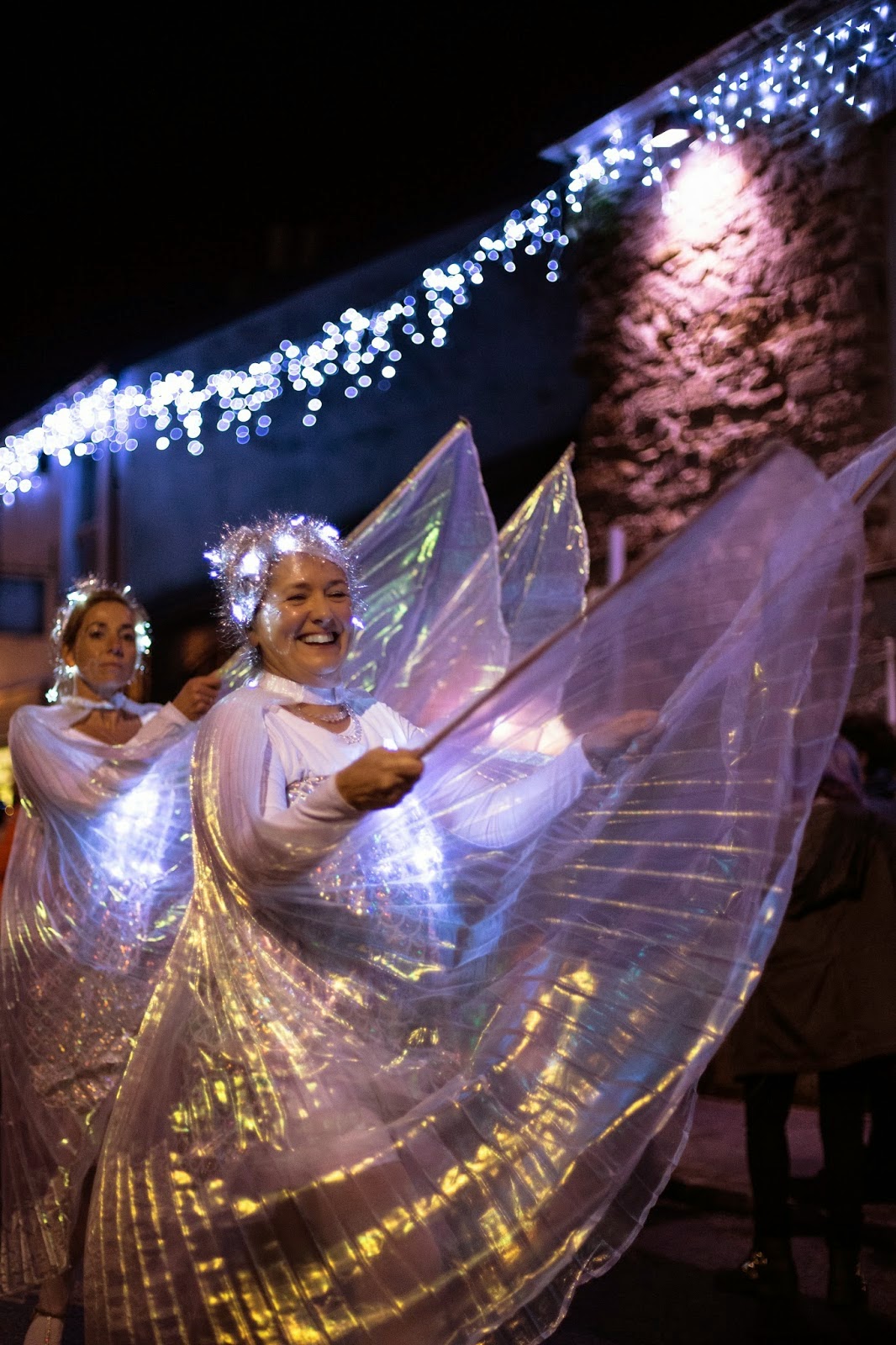
I was lucky to capture this image as I did not have a press pass for the event. Luckily I spotted someone that did have a pass who had 3 members of one of the groups posing meaning I could get a similar shot to him. The vibrant costumes that stand out from the dull and dark background with the 'wings' slightly illuminated by these is what made me put this photo in my final 3.

I did not like colours and informative background but after dicussing this with other press students we decided that this emphasises he vibrance and luminace of the subject of the photo. It also emphasises that the event really brings a large community together.


My final of the 3 images is a close cropped image of just one member of a group. I had a very similar image which was slightly technically better than this one of the woman in the background. The reason I didn't choose this was because the excitement and happyness which this woman shows really portrays the general atmosphere of the whole night in contrast the woman behind who didn't seem like she wanted to be there. It brings an element into the photograph that I had no control over making it unique and the main reason why I put it in my final 3.

I also love the out of focus seasonal lights in the background which add not only aesthetics to the image but also important infomation showing the viewer that it is approaching Christmas. This is significant due to it being one of the first Christmas events of the year.

The Establishing Image - Community - Truro City Of Lights - Final 7


Thursday, 20 November 2014

Initial Ideas - The Establishing Image

These are some initial ideas I have for the 'Establishing Image' brief.

Isolation -
'A lack of contact between persons, groups, or whole societies'
For isolation, I'd like to steer away from people and focus on something more descrete. I think this may make a more interesting photo as the subject which will be representing isolation may not be as obvious as an 'isolated' person.

- Rock in sea - long exposure - B&W - empty background - rock and sea only things in image - really expresses isolation.
- Single tree in a large fied - strong composition is key - probably B&W.


Industrial Coast -
- Mines - external flash (recently learned how to use and very dark situations are likely - also adds a unique feature due to artifical light)
- Docks - landscape (clear establishing shot) - possibly a view over Falmouth Docks - shows size and range of activities within the area.


Community -
- Animals - group of same species to show community - diverse contrast to a community of people (unique) - birds, deer, sea?

REVISED:

As Falmouth is a seaside town with a large fishing and water based industry, I thought the coast guard would be a large part of the community.

My main interest in photography lie within sports and action. Therefore, shooting with the local coast guards is of great interest to me.

I looked them up and got a contact number and address for them:Castle Dr, Falmouth, Cornwall TR11 4WZ
Phone: 01326 310800

After ringing this number I was given 2 more numbers to local coast guards in order to organise a shoot with them at a trainin session.


REVISED:

I found out about Truro City of Lights which is an event every year that involves a huge community coming together to celebrate the turning on of the christmas lights. Small communities such as schools, university groups, bands, etc. parade through the streets some of them carrying huge chinese lantern sculptures. I have decided to shoot this event for community as the opportunity has come up.

Wednesday, 19 November 2014

Relevant Photographers to Surfboard Shaper - Person At Work

 
Ocean Driven Media is a company made up of two individuals, Wade Howard and Mike van Heerden. They often take on large projects such as large events or weddings including smaller ones such as shooting Derek a surfboard shaper they had known for many years.


The picture I have chosen out of this project uses very similar techniques to mine to show a person at work. For example, the perfect symmetry of the image is replicated in this image shot by Ocean Driven Media which is very similar to my photo (below) of Seabase. We have both used a shallow depth of field to drop the foreground out of the point of focus and draw the viewer's attention to the shaper. Also, they both show the shapers doing the same job, sanding down the boards. The composition is clearly the most important part of both of these photos and it looks like Ocean Driven Media have chosen to do this for the same reasons as I did; to make the job of the shaper as clear as possible. Doing this could make an uninteresting photograph but by adding in the shallow depth of field and carefully framed composition, they both make interesting and informative images.


Alexandre Adel Musso is a designer/photographer from Morocco who took this image of a surfboard shaper. I love the detail that is shown in the image which is due to the tight framing and also how he has frozen the action of the belt sander. Freezing the action makes the image more interesting because it is a detail that you would not normally be able to see. As I mentioned about the images above, the depth of field in this image is used in the foreground to draw attention to the action in the photograph to clearly show a 'person at work'.

Also, Musso chose to convert to black and white as I did in my photographs. The contrast in this photo is probably my favorite aspect comparing the pitch black background to the white foam of the board.

Not showing the actual person at work and just showing their hand also makes the image more interesting to me. It could be seen as less personal due to not being able to see their face; but I find the detail and precision of the work and how close the camera is to the action gives it a unique feel that would not be possible if the image was shot wider.


Peter Politanoff is a professional freelance photographer from Los Angeles, USA. He took this picture of a surfboard shaper. This image is of Mike Geib shaping a surfboard.

This picture is very similar to mine which can be seen below. The shapers are both using the same sanding tool at a similar part of the shaping process. We also both made our images black and white. I did this because I felt the contrast looked stronger this way and it improve the looks of the image due to their being flat and 'boring' colours in the colour version.

I have found that having a persons head in an image can be distracting if it is not the main subject of the image. This may be the reason Politanoff decided to crop this part of the scene out to ensure the focus was on the sanding process. This is the same reason I decided to only show what I felt was the important parts of the room to show a person at work in the most informative way.

The only part of this photograph I don't like is the distracting hand/arm in the foreground. Although it does not cover the subject of the image; the extremely strong contrast draws your eye towards it when it does not give us any more information about the profession.


Tuesday, 18 November 2014

Final Image - Surfboard Shaper - Person At Work


I have chosen this image as my final for this shoot because I love the aesthetic look of the symertry of the board that I carefully framed and the shallow depth of field to compliment this. Others that looked at my final 3 shots also agreed that this was the best one for the same reasons. It was also pointed out that the frozen action and contrast between the blacks on the shaper and the whites of the board made the image even more interesting and clearly showed a 'person at work'.


After discussing this final image with others from my course, I have decided to change my final image to this.

There is more going in within this image which make it more interesting along with the feeling of freezing motion where the shaper is sanding the blank down.

Another aspect of this image I really like is the visible dust coming off the board in the bottom of the image. It goes almost the width of the frame but just in the bottom third which adds a very nice effect.

At first, one of the reasons for not choosing this image as my final was because the shapers head is cut off. After relooking at it, I have decided that this is not an important part of the image and that the action of the shapers hands is the main subject.


Final 3 Images of Surfboard Shaper - Person At Work


My favourite aspect of this image is the composition. I carefully lined the stringer of the board up to be exactly in the centre of the frame. This effect is enhanced by the fact that the board is exactly symmetrical leaving a very aesthetic appearance. Also, the lights in the room were only waist high. After speaking to the shaper about this he told me that it was to create a shadow on the 'rail' of the board to help ensure it is symmetrical. Although I did not plan this to be part of my photos, I found that it made for interesting light because the image naturally becomes darker towards the top which is opposite to what would normally happen when shooting inside. The main subject of the image is the shaper checking the surface of the 'blank' that he has just sanded. He hand being raised adds interest to the image because it shows him pausing to check for minor detail in his work. I chose to have the shaper to be the only thing in the point of focus. The background is extremely plain as is the foreground and the foreground has been clearly dropped out of the point of focus to ensure the attention is just on the shaper clearly showing him at work. I chose to convert this image into black and white because the colours in the room were very dull and including them in the picture did not enhance it.


This image is in my final 3 for several reasons. Firstly the detail it shows in the shapers hands and his work has a distinctive contrast to that of the board. Although this is not an aspect that shows a 'person at work', it makes for an interesting image. The shot is quite tightly framed which shows the detail and precision of the work (this is the final stage of the process where the shaper writes the size of the board and signs it on the stringer on the underside of the board). Again I have used a high aperture to drop the foreground out of focus to draw the attention to the subject of the photograph which is the shapers right hand writing on the blank. I think this can be a useful and important technique for this project as it can help draw the viewer’s focus just onto the part of the image that clearly shows a 'person at work'.


This is my final of the 3 images I have chosen. I chose it because it shows the main part of the shapers job which is sanding. Each board must be sanded extremely carefully to ensure it has no defects in it which is very time consuming. In this image I have chosen to make the point of focus in the foreground of the image. This is a contrast to the other two of my final 3 images. One of the main parts of this image I liked is the action involved in it. If you look carefully at the image you can see dust falling from under the sand paper. It was quite hard to freeze the action due to the low light; therefore I had to push up the ISO to 1000. This has reduced the image quality slightly which is noticeable if you look carefully at the image. Also, there is a little too much empty space to the right of the image. I do not like this because I feel that everything in a picture should add to it or give it more information. An empty wall and untidy floor does not do this for me.


Final 8 Images for Surfboard Shaper - Person At Work


Seabase (Quiver) Surfboard Shaper - Newquay Person At Work

I have always had an interest in surf photography so photographing a shaper was one of the first shoots I thought about when given the 'Person at Work' brief. I knew of a popular shaper in Newquay called Seabase that I had visited before so I gave them a ring. At first I struggled to get a date to shoot due to difficulties with transport, their machine breaking and their shaper not being in. Eventually I managed to do the shoot. Below are my favourite images from the shoot edited down and processed.

Friday, 10 October 2014

Relevant Photographer to Clay' Barber - Analysis

This photo was taken by Dawoud Bay in 1976 (printed in 2005). The first thing I noticed about this picture was that the Bay had chosen to shoot in black and white. Colour photography had been around for quite a while but Bay still made the concious decision to shoot in black and white. While looking specifically into Clay's Barbers, I noticed that the colours in the building were very bland and flat. This would not have made for an interesting colour photograph and I am wondering if this is the reason for Bay choosing to shoot in black and white. The image shows the environment the barber works in since it is not a tightly shot as my images. Although this photograph was taken 38 years before mine, there are a large number of similarities in what Bay and I have chosen to include in our pictures for example showing a large number of specialist barber equipment.


Jimmy Jeong is a photojounalist from Vancouver, Canada. He aims to tell honest stories through his photographs in his editorial, commercial and portrait work.

This image was take on 14th July 2008 at the Kings Barbers Salon in Vancouver. Much like my photographs of Clay's, Jeong has shot the barber whilst he is working on the client instead of staging a portrait; this is to sow the 'person at work'. There are several similarities in mine and Jeong's photos including them both being in black and white. The contrast in this image is very aesthetic which is likely to be why Jeong chose black and white over colour. I love the composition in the photo. The barber is right in the middle of the shot with his client to the left and then a unique angle of another barber at work in the background which is visible in the mirror on he right of the image. Since Jeong as used a low apature, the viewer can see detail in the entire image meaning both barbers can clearly be seen and the environment they are working in can also be gauged.


Rita Firmino de Sa is a freelance photographer, artist and writer based in London.

This image is the most like mine out of these three. It is shot far tighter to the subjects and really concentrates the viewers focus on the detailed work being done using a shallow depth of field. Also, Rita has used te barbers hands/arms to put a frame within a frame which adds another interesting element to the photo. Below is my photograph that is similar to this one. We also both shot in black and white again. As I found, most photographers feel that shooting in black and white in barber shops produces a far more desirable final image since the detail in the hair and contrast are improved. Also, the colours are often dull in these shops potentially making for a flat and uninteresting colour image.


This image was shot by Roberta Cucchiaro in Xinjiang, China of a street barber in summer 2006.

One of the reasons I liked this image was that it feels that the man and woman in the shot do not know the image is being taken or that the photographer is even there. The fact that the shot has also clearly been taken very close to the man and woman makes this aspect even better. I feel that the sense of invisibility in any photograph gives it a far more natural and therefore informative and accurate photograph.

This image is fairly similar to mine that I have shown above in that the subject is not looking at the camera. Since Cucchiaro's image is shot on the streets of China and mine was in a barbers shop I feel that Cucchiaro's feels far more natural and makes for a better image in this respect.

Person At Work - Clay's - Final Image

I chose this as my final image because I love the way Garnett and the work being done is framed within the barbrs arms and body. I have fully dropped the barber out of focus in order to draw the attention to the main focus point being the work being done in the centre of the frame.

It has been converted to black and white because I felt that contrast looked far better and since the lighting in the barbers was very poor, the colours were flat throughout the image.

The one part of this image I do not like is the arm of the barber being slightly over exposed. I feel that this slightly draws my attention away from the subject becaus it stands out so much being bright.

Thursday, 9 October 2014

Final 3 - Clay's - Person At Work

These are the final 3 images for my Clay's shoot. They are all close ups because I felt that this shows the skill and precision of the barber that I shot working. It also helps to show detail.


One of my favorite aspects of this first photograph is the hair on the barbers hand. It has great contrast against the white of his skin and shows how hands on his job is.

One of the things in this image I didn't like is the left hand of the barber. It is over exposed and in my opinion takes up too much of the frame. Another part of the picture I didn't like was the fact that I find the background quite distracting. The gown that the subject is wearing has quite a complicated texture which could direct the viewers eyes away from the subject.  Other than this I feel that this photograph shows a 'person at work' well and is interesting to look at.


The main part of this photo that I like is the composition. The subject of the photo is being framed by the arms and head of the barber. These parts of the image are dropped out of the point of focus which leads the viewers eye directly to the subject directly in the centre of the frame. This really shows the viewer a person at work and gives a unique angle of it.

The only part of this image I don't like is very similar to the last. The left arm of the barber is again over exposed

This is the final of the 3 images. I chose this one for several reasons. One of the reasons is very subtle which is the aesthetic lighting on the small section of comb and from the out of focus lights in the background. Although this may not make the photo technically better, I feel it improves the aesthetics which makes it more interesting to look at.
Also, this is probably the clearest image in terms of showing what the worker is doing. The detail is very precise and you can see each individual hair coming through the comb that the barber is about to cut off. This shows precision and detail in the barbes work.